How VeniS Atelier Puts a Caliterranean™ Interior Together
We love making color mood boards. But how do we actually use those colors in a real room? From Palette to Room is about doing exactly that—taking coastal color and material inspiration and translating it into interiors you can actually live in. Choosing the colors we’re drawn to is easy. The interesting part is deciding what becomes stone, what becomes wood, what belongs to the architecture—and what probably doesn’t need to come home from the décor store at all.
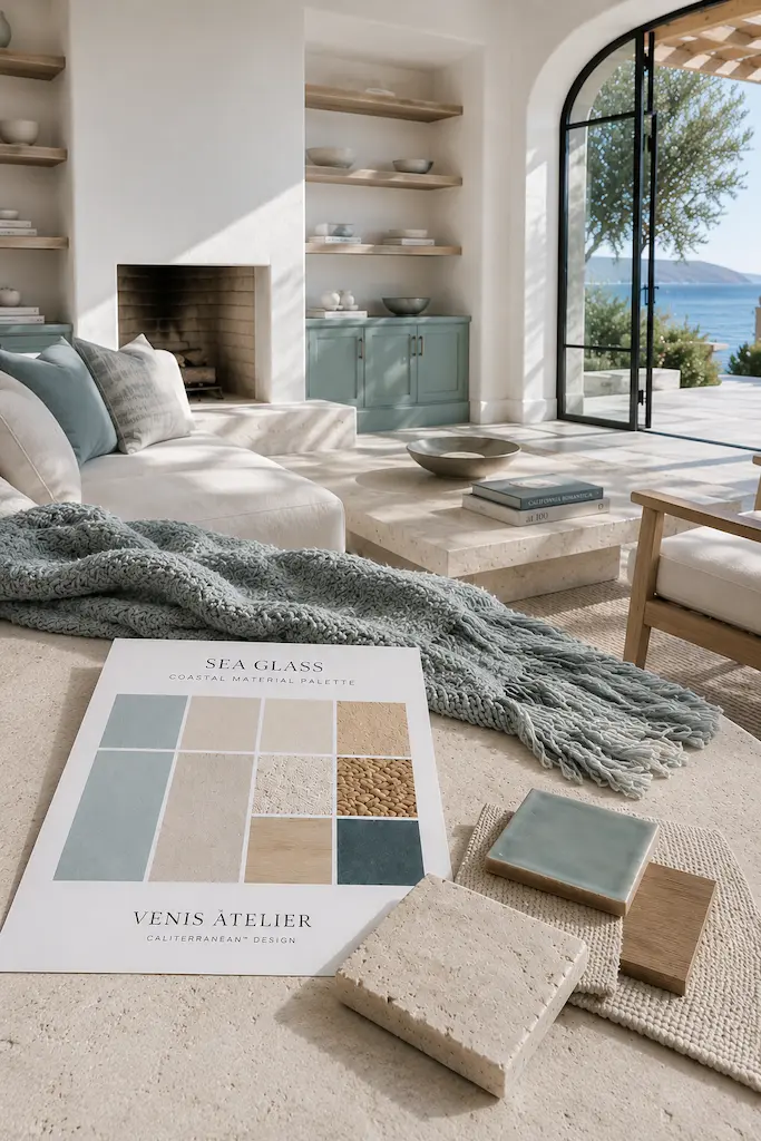
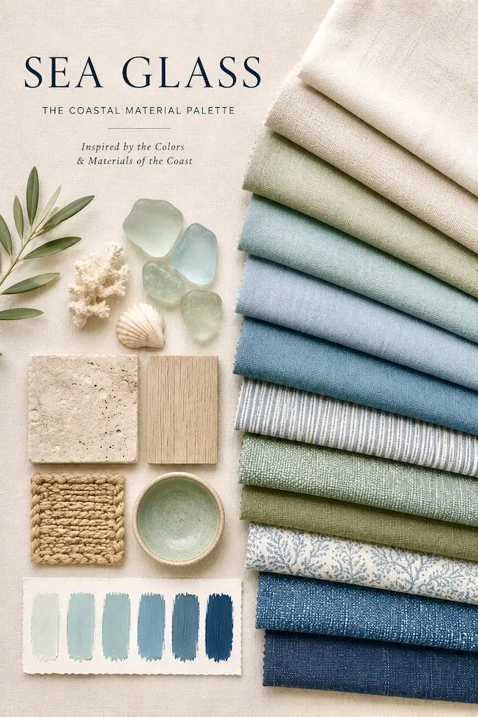
IT STARTED WITH SEA GLASS
Something curious happened on our social media. We created a Coastal Material Palette called Sea Glass: washed blues, creamy whites, pale stone, natural wood, woven fibers and glazed ceramic. No spectacular villa. No infinity pool dangling over the Mediterranean. Not even an impossibly photogenic bowl of lemons. Just materials and color. More than 500 people saved it in less than a month. We noticed.
Our California and Mediterranean color palettes have consistently been among the images readers like to keep. Apparently, we are all perfectly capable of losing twenty minutes deciding whether a piece of stone is sand, oatmeal or warm ivory. We consider this time well spent. But all those saves raised a more useful question. What happens after you save the palette?
THE PINTEREST FOLDER IS FULL. NOW WHAT?
There it sits. Sea Glass. Warm Sand. Inky Blue. A beautiful piece of limestone. Some lovely wood grain. A fabric you would quite happily wrap your entire life in. Save. And then? A palette can tell us which colors look beautiful together. It cannot tell us whether the blue belongs on the kitchen cabinets or the sofa, whether the stone should become a floor or a coffee table, or why copying every element in equal amounts might result in a room that looks suspiciously like a very tasteful seaside gift shop. We know we like it, we saved it, but what do we do next? We buy the paint? This is the part of color inspiration we don’t see enough. So we’re going to do something about it.
Welcome to From Palette to Room, our homes series in which we take the palettes you love saving and actually build interiors from them. Not metaphorically. We’re going to show you the rooms.
FIRST, FORGET “COASTAL DECORATING”
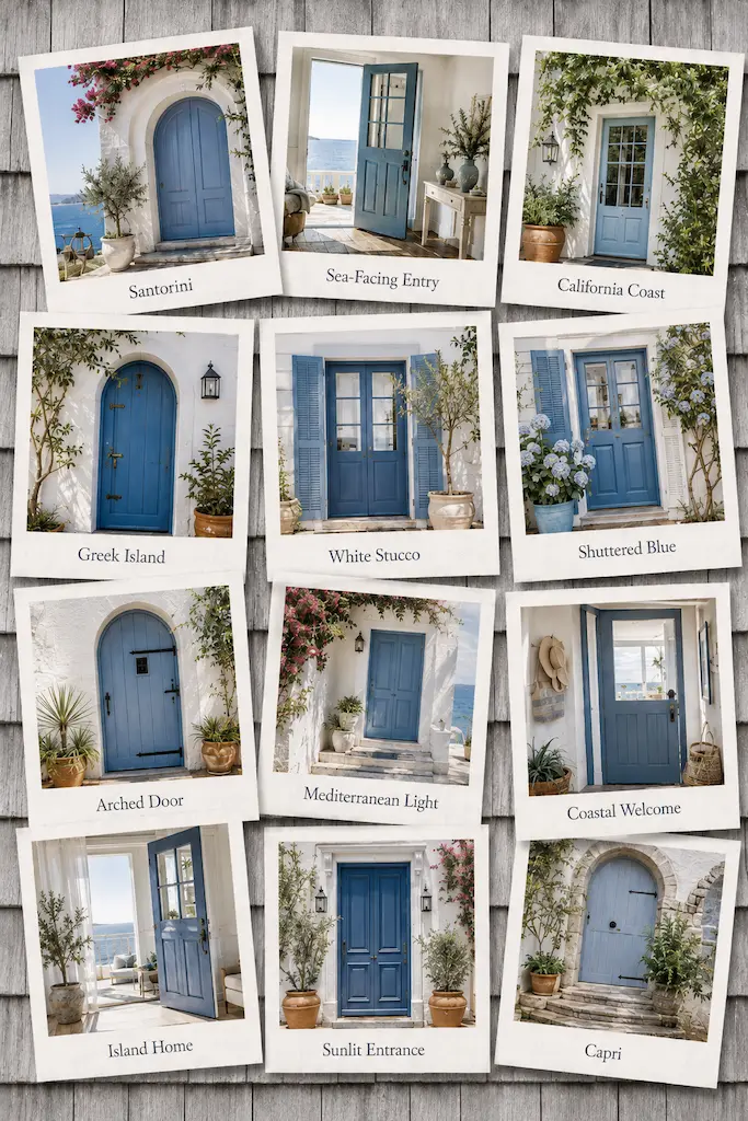
There is already plenty of advice about how to make a home feel coastal. Blue and white. Natural fibers. Stripes. Light wood. Something woven. Add a plant. Open the windows. The coast has apparently been thoroughly briefed. We’re interested in something else. The California and Mediterranean homes we return to again and again rarely depend on decoration to establish their character. Their beauty often comes from the house itself: thick plaster walls, stone floors, deep window openings, built-in benches, tiled niches, open shelves, sculptural stairs and rooms designed around light. The architecture is already decorating.
That idea sits at the center of Caliterranean™ home Design: Less decorating. More architecture. And it changes completely how we approach a color palette.
DON’T BRING THE PALETTE INTO THE ROOM. BUILD IT INTO THE ROOM.
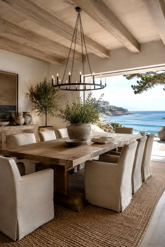
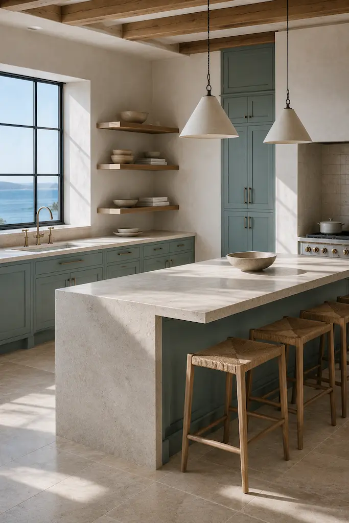
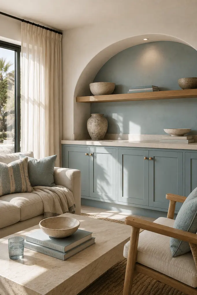
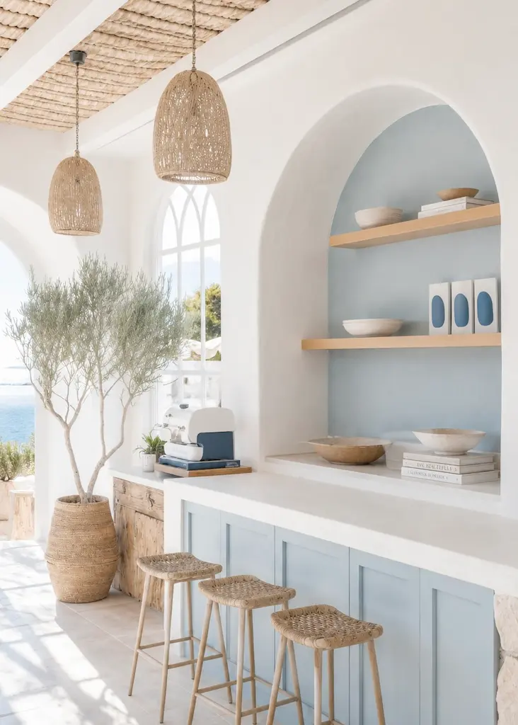
Take our Sea Glass palette. The obvious approach would be to find some blue cushions, a beige rug, a wooden coffee table and perhaps a tasteful aqua vase. Perfectly nice. Also perfectly predictable. Instead, suppose Warm Sand becomes the limestone floor. Sea Glass becomes built-in kitchen cabinetry. Natural wood becomes wall-to-wall open shelving. Warm white becomes the plaster finish on the walls. A darker Inky Blue appears in a small area of glazed ceramic. Before we’ve bought a single decorative object, most of the palette is already in the room.
That gives us our first rule: build the palette into the room before bringing the palette into the room.
A HEX CODE ISN’T AN INTERIOR
This is where color palettes can be slightly deceptive. We can give you the precise code for a beautiful sandy beige, but paint that color onto a perfectly smooth wall and it won’t feel the same as limestone. Likewise, brown paint is not wood. Sea green paint is not a translucent ceramic glaze. Warm white laminate isn’t chalky plaster. Same color family. Entirely different experience.
Materials do something color codes can’t: they react to the room. Wood contains grain and variation. Limestone has fossils, pores and tiny shifts in tone. Ceramic glaze pools differently around an imperfect edge. Plaster absorbs light rather than simply reflecting it. Suddenly one “color” becomes twenty slightly different colors throughout the day, which saves us from needing twenty actual colors.
THE VENIS ATELIER 3 × 3
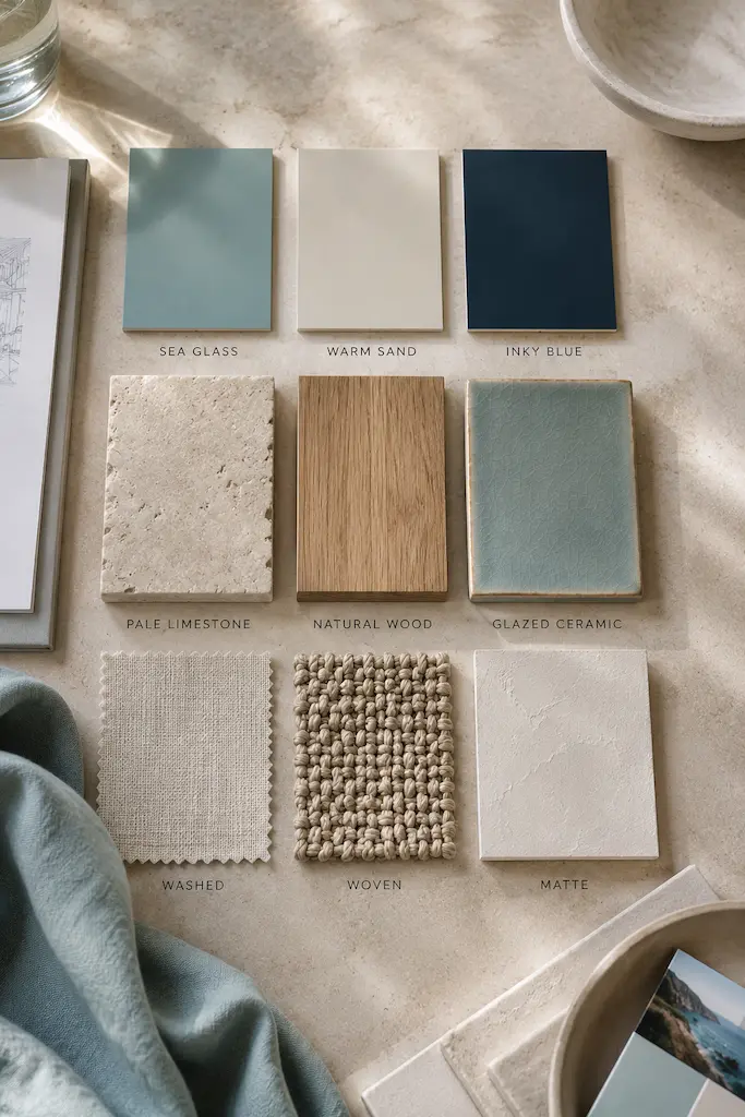
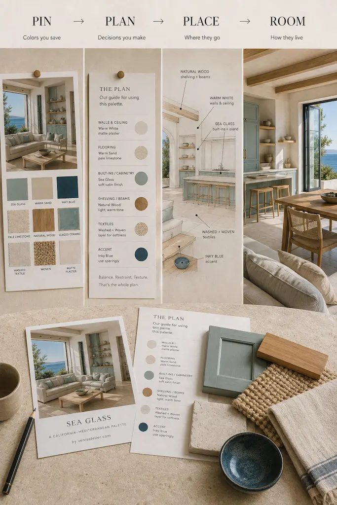
This is where from palette to room gets practical. For each story, we’ll start with the larger palette and choose nine elements that form the design language of the interior. For Sea Glass, that might look like this:
3 COLORS — Sea Glass, Warm Sand, Inky Blue. These establish the atmosphere, but they won’t receive equal billing. One can dominate, another can support, and the strongest may barely appear at all.
3 MATERIALS — Pale Limestone, Natural Wood, Glazed Ceramic. These turn abstract colors into surfaces that can actually become part of a home.
3 TEXTURES — Washed, Woven, Matte. These stop a limited palette from becoming flat and give our quieter colors something interesting to do.
Three colors. Three materials. Three textures. Nine ingredients are quite enough. We’re designing a room, not opening a sample library.
GIVE THE COLORS JOBS
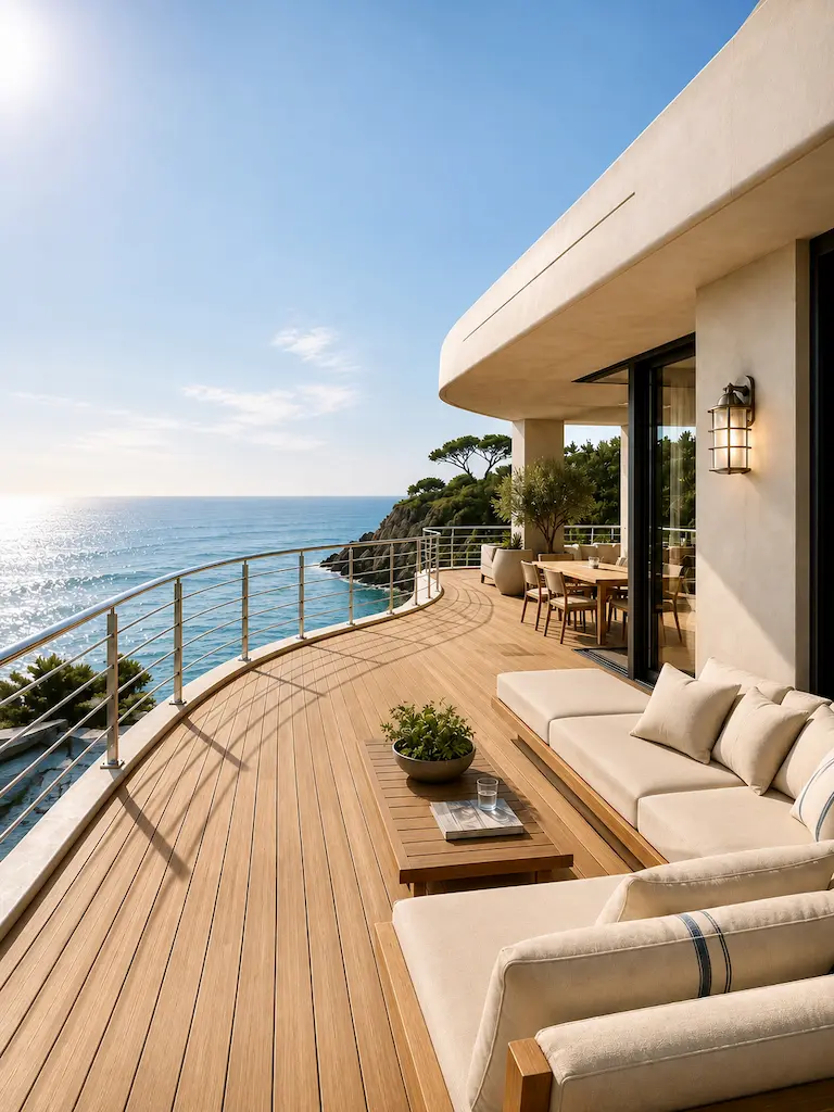
Nature is rather good at this. Stand on a Mediterranean terrace and the dark blue sea may be the thing you remember most, yet it probably occupies a relatively small part of what you’re seeing. Around it are enormous quantities of pale sky, stone, plaster, earth and vegetation. The blue is powerful partly because everything around it knows when to be quiet. We can steal that idea.
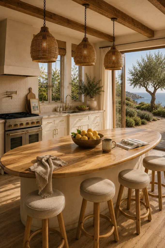
Instead of asking, How much blue should I use?, ask what should the blue do? In a Sea Glass kitchen, it might become cabinetry. Warm Sand could become the limestone floor and counter. Natural wood could form a long open shelf. Inky Blue might appear only in a few glazed ceramic pieces.
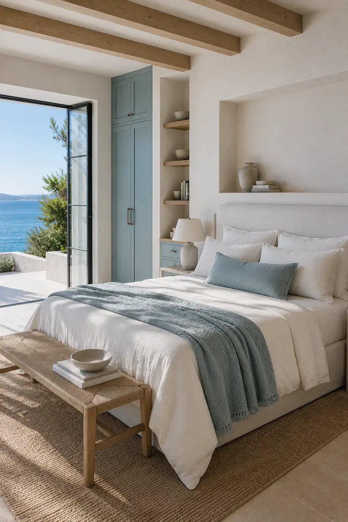
Move into the living room and everyone changes jobs. Warm Sand becomes dominant through stone and upholstery. Sea Glass retreats to a washed textile or chair. Wood becomes a built-in bench or shelving. Inky Blue gets perhaps one small moment. Then we reach the bedroom, where Sea Glass might move entirely into washed bedding while plaster, pale stone and wood create the room around it.
Same palette. Completely different interiors. That is how rooms can belong together without dressing like triplets. And if Inky Blue is the most dramatic color in the palette, we don’t automatically give it a wall. Maybe it gets a ceramic lamp. Sometimes the smallest role gets the best line.
BEFORE YOU BUY IT, ASK IF YOU CAN BUILD IT
This may become our favorite question in the series. Want more warm wood in the room? Before buying another little wooden table, could you make the shelves wood? Need more Sea Glass? Before ordering four blue cushions, could an existing built-in cupboard become Sea Glass instead? Want more Sandstone? Perhaps it isn’t another beige object. Perhaps it’s the fireplace surround.
The larger and more permanent elements of a room have enormous visual power. Let them do some work before asking the accessories department to rescue the situation. It may even save us from the mysterious phenomenon in which a room somehow acquires seventeen cushions while still feeling unfinished.
Let the kitchen borrow the water through Sea Glass cabinetry. Let the living room borrow the shore through limestone and Warm Sand. Let the bedroom borrow the hazier colors of the sky through washed textiles. The repetition of wood, stone, plaster and undertones quietly connects everything. No matching required. The rooms are related. They don’t need uniforms.
ARCHITECTURE DOESN’T HAVE TO MEAN RENOVATION
At this point, anyone not currently building a villa may reasonably be wondering whether we’ve lost our minds. We haven’t. Thinking architecturally doesn’t necessarily mean knocking down walls, hiring an excavator or explaining something expensive to your partner. The principle is integration, not construction.
Run curtains from floor to ceiling rather than treating them as little pieces of window decoration. Use one long shelf across a wall rather than several unrelated storage pieces. Fit a bench into an awkward corner. Paint existing cabinetry so it becomes part of the palette. Allow one material or finish to continue uninterrupted instead of breaking every surface into another decorative moment. These are architectural decisions in spirit, even when nobody is calling a contractor.
The question isn’t always What can we add? Sometimes the better question is how can the things already here belong together better?
TEXTURE IS WHAT SAVES QUIET ROOMS FROM BEING BORING
Caliterranean™ interiors often use surprisingly restrained color. That works because restraint doesn’t mean sameness. Imagine a room containing chalky white plaster, creamy honed limestone, warm-grained wood, loosely woven fabric and irregular glazed ceramic. On a color chart, most of it might occupy a rather uneventful corner somewhere between white and beige. In the room, each surface catches light differently.
That’s texture doing the work we often expect decoration to do. A matte plaster wall absorbs light. Honed stone softens it. Glazed ceramic catches it. Wood warms it. Fabric diffuses it. Suddenly the room has movement without asking a single decorative object to perform acrobatics. And unlike the eighteenth cushion, texture doesn’t need fluffing.
AND THEN, FINALLY, WE DECORATE
Yes, eventually you may buy something. We’re not monsters. Once the architecture, materials, color and texture have established the room, the final layer becomes much easier: a ceramic vessel, art you actually like, books you actually read, a textile brought home from somewhere memorable, a plant determined to survive your particular level of horticultural commitment. Objects should add life rather than explain the concept. If we have to place a shell on the coffee table so everyone understands that this is a coastal interior, something has gone terribly wrong upstream.
COASTAL COLOR DOESN’T HAVE TO LOOK COASTAL
This is especially important for VeniS Atelier. We’re inspired by California and the Mediterranean, but we’re not interested in reproducing either one literally. The coasts are our color and material library. Pacific fog and weathered wood. Ojai ochre and olive. Greek white and Aegean blue. Provençal lavender and limestone. Italian terracotta and cypress. Riviera yellow against a brilliant summer sky. And Sea Glass, of course.
But the lesson travels. These combinations can live in an apartment in Chicago just as naturally as a house in Malibu. You don’t need a sea view to understand the relationship between cool blue and warm stone, between chalky plaster and natural wood, or between one dramatic color and a room full of quieter ones. The destination provides the lesson. Your home doesn’t need the post code.
SO THIS IS FROM PALETTE TO ROOM
From now on, some of the VeniS Atelier palettes you save most will become full interiors. We’ll begin with the original inspiration, identify what makes the combination work, and create our 3 Colors × 3 Materials × 3 Textures. Then we’ll take those ingredients through three different rooms—a kitchen, a living room and a bedroom—and, when a palette calls for it, a fourth space where the same combination can behave completely differently.
We’ll show what should become architecture, where material can do the job of color, how texture changes the result and, equally important, where we would deliberately use less. A blue might become cabinetry rather than a cushion. Sand might become limestone rather than beige paint. Brown may not appear as a “color” at all because the wood is already doing the work. The palette gives us the idea; architecture, material and texture decide what that idea becomes.
Those 500 Sea Glass saves made us realize something very simple: most of us already know what we love when we see it. The harder part comes after the save, when the inspiration has to leave the screen and become a real room. From Palette to Room is our way of closing that gap. We start with the palette, read the materials, give the colors jobs, build what we can into the room and decorate only what remains.
Because perhaps the best coastal interior is the one that never has to tell you it’s coastal.
CONTINUE EXPLORING
Inspired by this story? The story continues. Here is your next read Caliterranean Homes: The Intelligence of Yacht Design, Brought Ashore →