How a Small Thessaloniki Apartment Used Color to Transform Its Mood
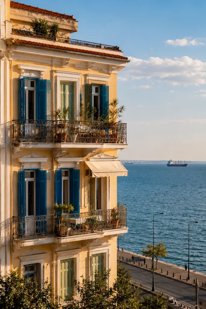
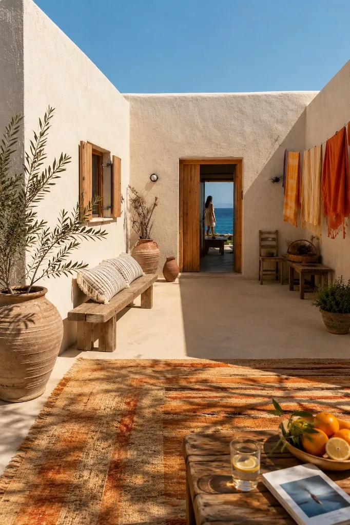
There is a dependable prescription for an old, small apartment in need of a refresh renovation: just paint it white. Maybe add natural wood, perhaps a little beige, and allow “making it feel larger” to become the governing principle of the entire renovation. There is nothing wrong with that approach. Light walls really can affect how spacious a room appears; experimental research has found that lighter walls and ceilings can increase perceived height, although some of the conventional wisdom about contrasting ceilings and walls turns out to be less reliable than decorators have long claimed. The question is whether appearing marginally larger is always the most interesting thing a home can aspire to.
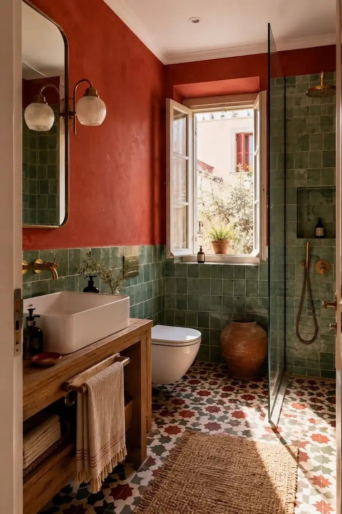
The renovation of a small apartment in Thessaloniki proves that color may actually create more joy than expected. The original character was not stripped away in pursuit of a white contemporary box; the idea was to strike a balance between the apartment’s classic elements and a thoroughly modern approach to color combinations. Pastels were allowed to sit beside stronger shades, quieter surfaces beside unapologetic ones. The bedroom became orange, the living room green, the bathroom embraced red, and an otherwise white office acquired a blue wall. Elsewhere blue met a yellow alcove, with a handmade red Murano glass vase providing the sort of third color that sensible decorating advice might politely remove—and that a memorable room often desperately needs.
The renovation inspiration looked toward Morocco rather than the white-and-blue Greece of postcards. In Thessaloniki, that borrowing is not quite the cultural leap it might first appear. The city was part of the Ottoman Empire from 1430 until 1912 and developed for centuries as a multicultural place shaped by Christian, Muslim, Jewish, Balkan and European communities; by the nineteenth century, its architecture had become notably eclectic. Morocco itself is hardly reducible to a handful of saturated paint chips: the historic medinas of Marrakesh and Fez combine zellige, lime plaster, carved and painted wood and centuries of Andalusian, African and eastern influences. The point, then, was never to turn a Greek apartment into a stage set for Marrakech. It was to borrow something more useful: confidence with color, contrast and decorative richness.
It is also a useful reminder that Greek homes have never been confined to white and blue. So the first question of the renovation was not, What color will make this room look biggest? but What should this room feel like? A small home does not need every room to dissolve into the next. Sometimes the greater luxury is distinction: a bedroom with warmth, a living room with energy, a bathroom willing to be dramatic, an office that wakes up the moment one wall turns blue. Square footage may be fixed. Mood is remarkably negotiable.
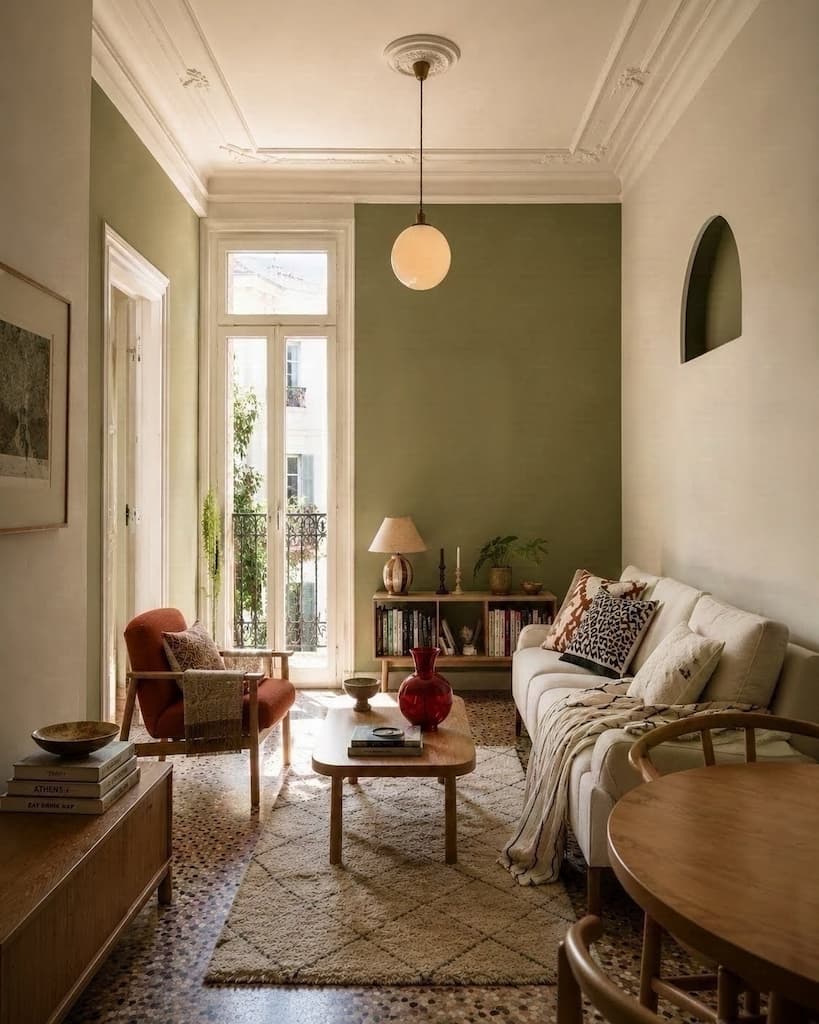
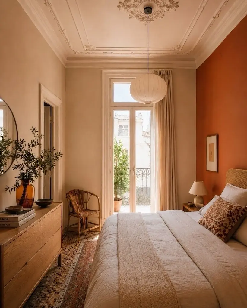
Bold color becomes difficult not when there is too much of it, but when every color is asked to shout at the same volume. Yellow and blue can be wonderful together because their contrast is immediate, but proportion matters more than the names on the paint tins. A large blue field beside a smaller yellow alcove creates hierarchy: one establishes the atmosphere while the other catches the eye. Put a red Murano vase inside that composition and the third color can work almost like punctuation. It breaks the neatness just enough to prevent the room from feeling as though it arrived pre-coordinated in a box.
Orange and green demand a different balance. Both can be warm, earthy and surprisingly compatible when one is softened or used in a smaller dose; make both equally saturated and equally dominant and the room may begin behaving like a fruit market. That is not an argument against the combination; it is an argument for hierarchy. Successful colorful rooms, like good movies, tend to have a main character, a supporting cast and somewhere for the eye to rest—the visual equivalent of the extras. A pastel can calm a stronger hue, old wood can absorb intensity, white can still be enormously useful without being required to govern the entire apartment, and existing stone, terrazzo or tile can provide a neutral pause without actually being neutral.
The bathroom is where the colors were most unexpected. A red-and-green scheme would be exhausting if it colonized every room, but bathrooms are enclosed and experienced differently from living spaces; their small scale makes them unusually good places for a more concentrated idea. Here red becomes the theme rather than merely an accent, with green tile providing the counterweight. The important distinction is between using color to give a room a personality and assigning every room a random personality simply because there was paint left over. Color and light also influence how people read and navigate interiors, which is one reason painted boundaries, contrasting recesses and changes in brightness can make separate zones feel more distinct even when the walls themselves have not moved.
The more useful rule is to look at the apartment before looking at the palette. Which original details deserve emphasis? What color already exists in the floor? How does daylight enter the room? Does an alcove need to disappear or become important? Which room can tolerate intensity, and which should provide a quieter pause? Once those questions are answered, mixing pastel shades with vibrant ones becomes less about bravery and more about composition.
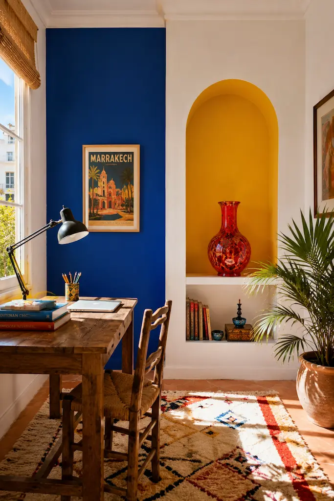
That is perhaps the most interesting thing about renovating an older Mediterranean apartment with paint: color can make the old architecture more visible rather than less. The instinct in many renovations is to neutralize first—to turn the background white so that whatever comes next appears modern. But contrast can be far more revealing. A colored wall can sharpen old moulding. A yellow recess can make an awkward architectural detail suddenly look intentional. Warm orange can change the reading of existing timber; green can pick up an overlooked note in an old floor; red can make handmade glass feel less like an accessory and more like part of the composition.
The Moroccan influence works best in exactly this loose way. Historic Moroccan interiors are compelling because color is rarely floating independently from architecture: it belongs to tile, plaster, wood, craft, light and shadow. Translating that spirit into Thessaloniki does not require importing every recognizable motif. In fact, doing so would probably make the apartment less interesting. A Greek home can borrow Moroccan warmth, add Italian Murano glass, retain its own older details and still belong completely to Thessaloniki. The Mediterranean has spent several thousand years exchanging materials, techniques and ideas; it seems unnecessarily strict to demand that the decorating stop at the border.
What holds such a home together is not a perfectly repeated palette but a consistent sensibility. Some colors are allowed to dominate, others appear only in an alcove, a tile or a single handmade object. Pastels create breathing room around more intense hues. Classic elements remain visible rather than being forced to compete with every new gesture. The details make the apartment feel personal rather than prescribed: elegant without being timid, distinctive without mistaking eccentricity for character.
White would undoubtedly have made this apartment easier. It may even have made certain rooms appear a little larger. But renovation is not always a competition to produce the greatest possible quantity of imaginary square footage. Sometimes an old home needs something less measurable: pleasure, surprise, a little tension, and colors that make one room feel distinctly different from the next. Paint cannot repair bad plumbing or move a load-bearing wall, but it can change what the eye notices, how one space relates to another and, most importantly, how it feels to come home. In a small apartment, that is not merely decoration. That is a renovation.
CONTINUE EXPLORING
Inspired by this story? Continue your journey with From Palette to Room: Sea Glass →