Coffee, Cream and the Surprisingly Rich Language of Neutrals
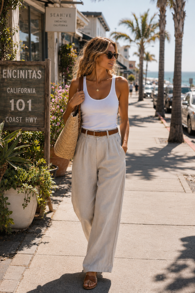
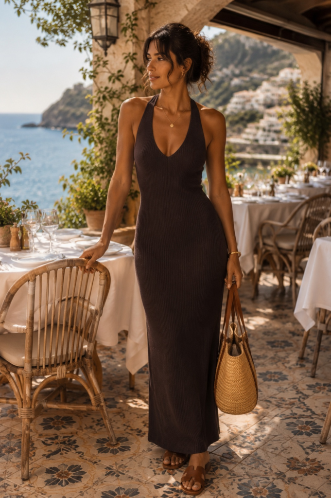
Beige has suffered from terrible public relations. For years it was shorthand for safe, sensible, and the color most likely to appear in a waiting room where nobody wanted you to stay too long. Fashion, meanwhile, quietly accumulated a much more flattering vocabulary: ivory, oat, ecru, sand, camel, stone, honey, tobacco, cappuccino, espresso. Apparently beige becomes infinitely more desirable once someone gives it breakfast.
That linguistic generosity is revealing. A good neutral wardrobe is rarely built from one color repeated politely from head to toe. It works because the shades are close enough to belong together and different enough to keep the eye interested. Coffee understands this perfectly. Espresso and café au lait begin with almost the same ingredients, yet nobody would confuse the two. Add more milk, less milk, foam, heat, dilution, and suddenly a narrow brown-and-cream spectrum contains an entire menu. Clothes behave much the same way. Cream beside white looks warm. Oat beside cream looks earthy. Honey beside oat becomes richer. Espresso beside all three gives the palette depth.
What appears to be a limited color story is actually a study in proportion. And that may be why neutrals are so often more interesting in real life than they are on a paint card. Clothing moves. Fabric absorbs and reflects light differently. A matte cotton shirt in warm white does not read the same way as a fluid ivory skirt. A loosely woven oat linen trouser catches shadows in its fibers. A deep brown knit can make pale cream look almost luminous. The colors are not doing all the work. The materials are. This is where the idea of a “neutral wardrobe” becomes much more useful than the familiar instruction to simply buy more beige. Matching everything exactly can flatten an outfit. Slight disagreement is what gives it dimension. Cream does not need to match cream. It needs something interesting to sit beside.


The fashion world has spent decades trying to convince us that neutrals are inherently restrained, tasteful, perhaps even morally superior to orange. They are not. Mediterranean wardrobes have never belonged exclusively to muted tones, and California is hardly afraid of color either. Bougainvillea, painted shutters, citrus, cobalt water, surf graphics, red swimsuits, striped umbrellas—both coasts are perfectly capable of making a scene.
What neutrals do particularly well is something different: they give texture and silhouette more room to speak. Remove a strong color contrast and suddenly the eye notices weave, weight, transparency, shine and construction. Luxury houses have long understood this. Loro Piana frequently builds entire looks from closely related shades of cream, beige, camel and brown, allowing cashmere, wool, silk and linen to create the contrast that stronger color normally would. A cream cotton poplin shirt beside an oatmeal trouser becomes a conversation between crispness and softness. A pale knit over a satin-like skirt creates contrast without introducing another hue. Tobacco, camel or espresso can anchor the whole thing without shouting from across the room.
This is why the most convincing neutral outfits rarely look perfectly coordinated. They look accumulated. A white shirt has been washed enough to lose its original brightness. Linen carries slubs and small irregularities. A woven bag introduces another shade entirely. One piece warms toward yellow, another cools toward gray, a third sits somewhere between sand and coffee and refuses to be categorized before breakfast. Good. That is usually where the outfit becomes believable.
Coastal light exaggerates these differences. At noon, pale cream can look almost white. Late in the day, the same fabric warms toward gold. Stone-colored linen deepens in shadow. Ivory silk picks up blue from the sky. Brown can look nearly black indoors and suddenly reveal red or olive undertones outside. This makes dressing in neutrals near the coast less monotonous than the term suggests. The palette changes constantly because the light does.
The same logic has moved well beyond clothing. RH’s current interiors lean heavily on greige, camel, sand, stone and warm beige, proving that when colors sit this close together, material and surface have to do more of the work. A camel rug beside pale stone operates much like an oat trouser beside an ivory shirt: the interest is in the difference you almost miss.
California and the Mediterranean share that particular complication: strong sun does not allow subtle color to remain particularly subtle. Perhaps that is why these shades feel so natural in a Caliterranean wardrobe. Not because either coastline has agreed upon some universal dress code of oatmeal and cream, but because the colors respond beautifully to environments where light, texture and natural materials are already doing most of the visual work.
A neutral wardrobe near the sea does not need to imitate the landscape. It only needs to stop competing with it.
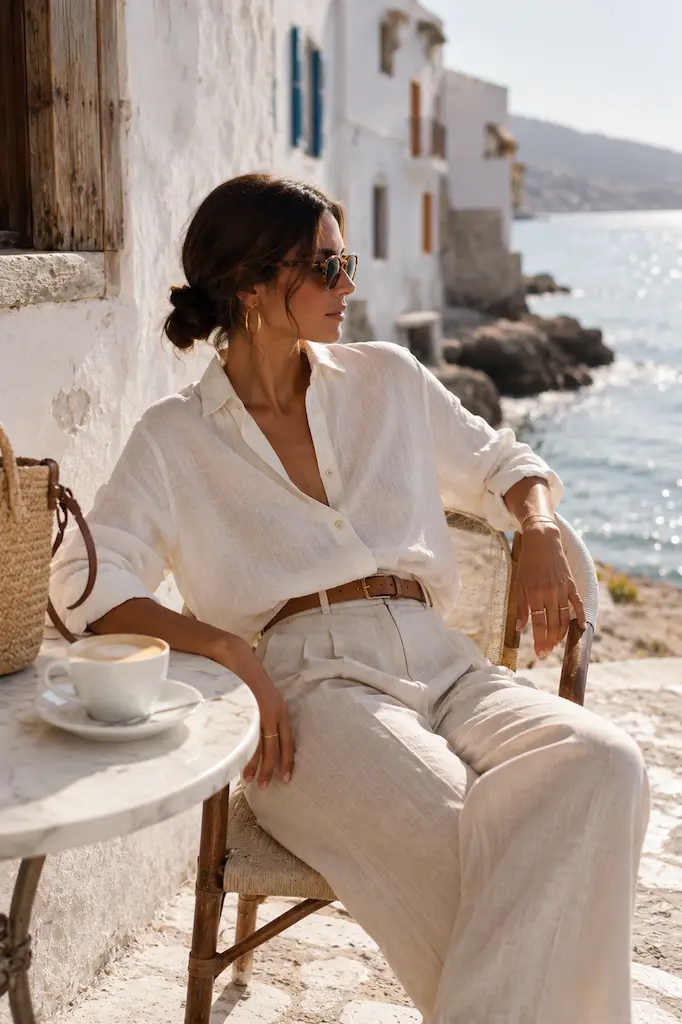
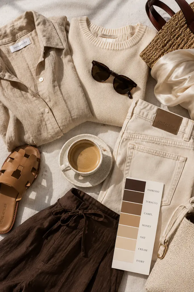
There is also a practical reason this palette survives beyond the occasional beige revival. Near-neutrals mix unusually well because they tolerate imprecision. A bright blue may demand an answer. Cream generally does not. Camel can sit beside white, navy, denim, olive or black without requiring a committee meeting. Espresso behaves almost like a softer black. Oat can replace stark white when the light feels too harsh. Honey adds warmth without becoming quite a color statement.
That flexibility makes a smaller wardrobe feel larger. It also prevents the familiar problem of “matching sets” becoming too precious. A cream top and cream trouser in slightly different shades often look better than two perfectly identical pieces. The eye reads the variation as depth rather than error—especially when the fabrics differ.
Fashion has a habit of making simple ideas unnecessarily complicated, but this one may deserve the terminology. Neutral dressing is not really about choosing less color. It is about choosing smaller differences. And small differences become surprisingly expressive when texture, light and proportion are allowed to take over.
This is why the café vocabulary works so well. Nobody orders “a beige.” Coffee understands that changing the ratio of nearly identical ingredients can completely alter the result. A wardrobe of cream, oat, honey, tobacco and espresso follows the same logic. The colors may whisper. They are not saying the same thing.
CONTINUE EXPLORING
Inspired by this story? Continue your journey with Blue & White on Both Shores →