The Ocean Has Been Unfairly Reduced To Blue
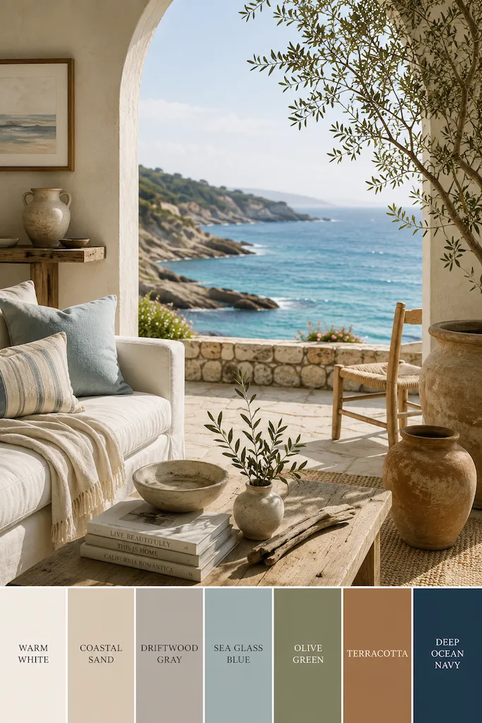

Blue is a convenient color for describing the ocean and sea. It fits neatly on paint charts, appears reliably on striped cushions, and saves us from having to explain the more complicated truth: the coast is mostly a collection of colors that refuse to stay still.
But walk along the shoreline early enough and the sea may look almost silver. By noon, it sharpens into turquoise, indigo, or a green so deep it seems borrowed from a bottle of olive oil. Around it are shell ivory, wet stone, faded timber, warm sand, chalky cliffs, rusted metal, seaweed, and the occasional sun-bleached towel someone optimistically believed would remain white. The sky joins in, naturally. Coastal light has never respected boundaries. This is why the most convincing coastal homes rarely begin with a particular shade of blue. They begin with observation. They notice how limestone brightens beneath the sun, how linen softens daylight, and how wood changes after years of salt air, open windows, and actual life.
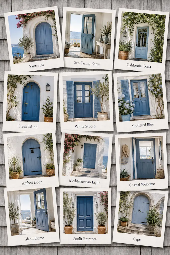
Mediterranean homes have understood this for centuries, although not because anyone was discussing palettes over mood boards. Materials were chosen because they were nearby, useful, and suited to the climate. Lime-washed walls reflected the summer heat. Stone kept rooms cool. Terracotta floors tolerated sand, bare feet, and the general inconvenience of people coming in from outside. The beauty arrived almost accidentally. A village house in Greece, southern Italy, or coastal Spain may contain several whites before anyone introduces a recognizable color. Chalk, cream, limestone, plaster, and sun-faded linen sit together without appearing overly coordinated. Their differences are slight, but those differences matter. They prevent the room from feeling flat.
Blue usually enters later. A painted shutter. A ceramic bowl. A narrow border of tile. A piece of cloth drying above a courtyard. It is memorable precisely because it has not been asked to decorate everything.
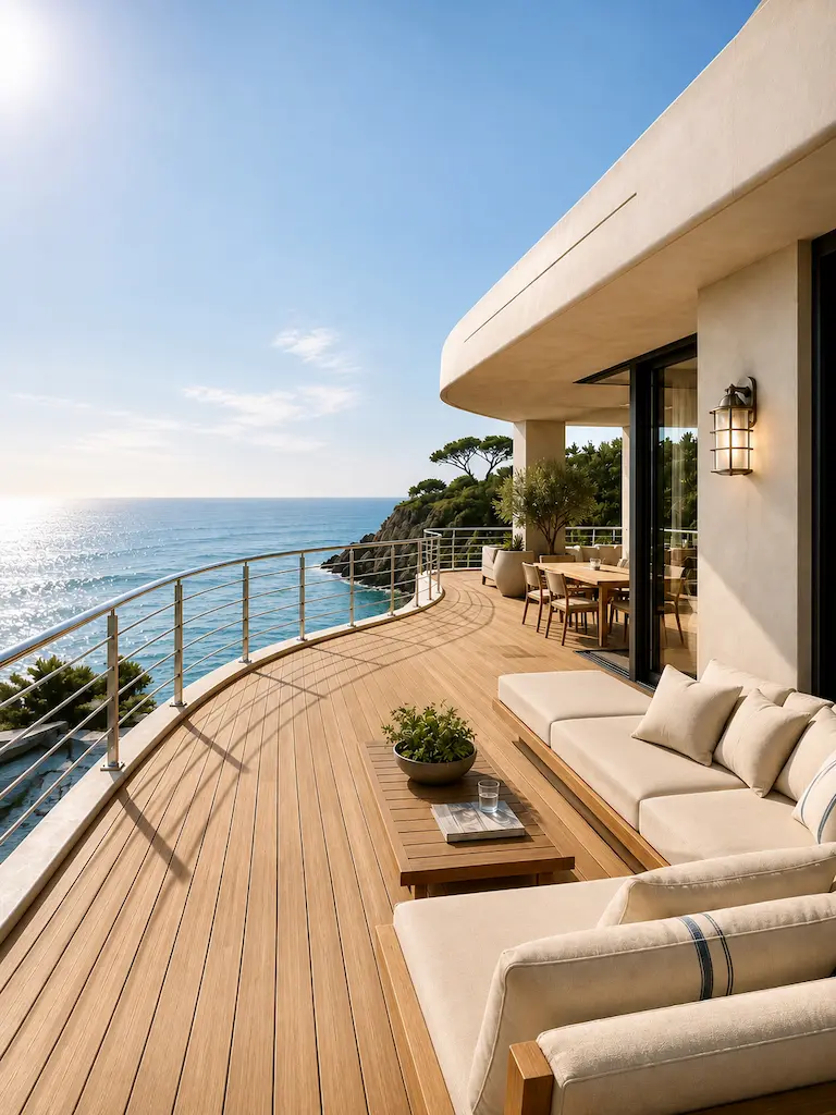
California approaches the same idea through a different coastline. Here, the Pacific often arrives beneath a marine layer, turning the horizon into a soft arrangement of mist, pewter, and pale blue. Cliffs contribute sandstone and ochre. Eucalyptus adds dusty green. Weathered fences fade toward gray, and beach houses collect the muted colors of wood left outdoors longer than its manufacturer probably intended. California interiors tend to translate this landscape through space and light. Rooms open outward. Windows become more important than walls. Materials are expected to age rather than remain permanently untouched, which is fortunate because coastal living has never been particularly compatible with perfection.
The Mediterranean offers density, shade, and stone. California offers openness, air, and timber. Yet both arrive at the same conclusion: color is not something applied after a room has been designed. It comes from the relationship between material and light. A white wall beside warm oak is not the same white wall beside polished concrete. Linen appears ivory in the morning and almost gray at dusk. Handmade ceramics hold tiny shadows around their irregular edges. Even a quiet room changes as the sun moves through it. That movement is the real coastal palette.
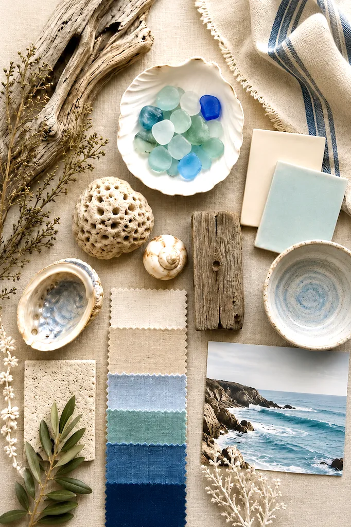
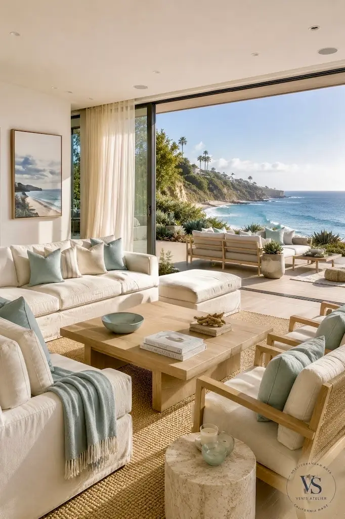
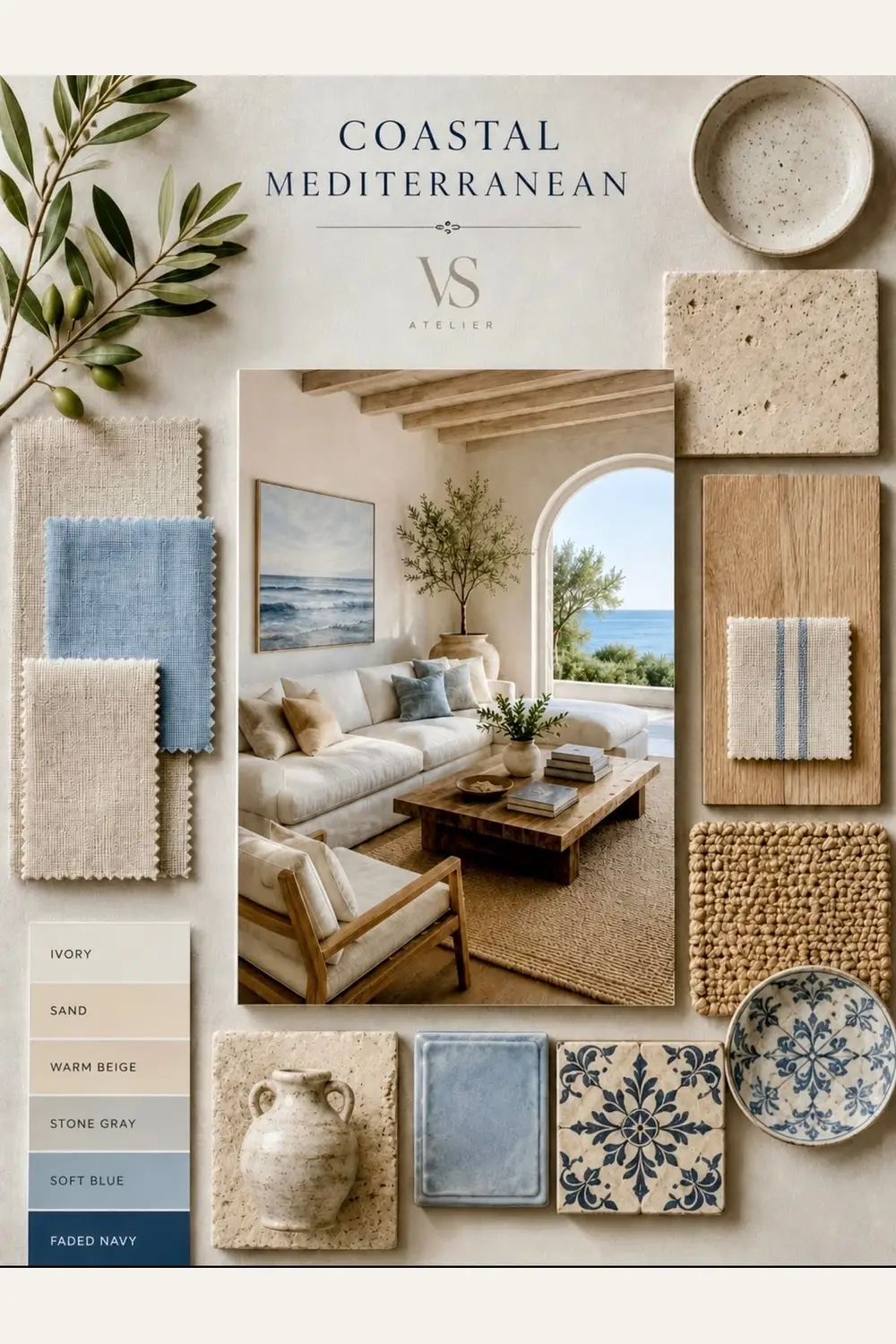
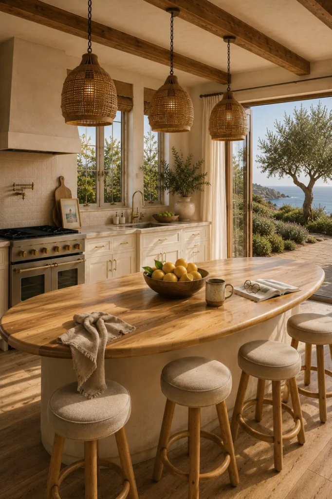
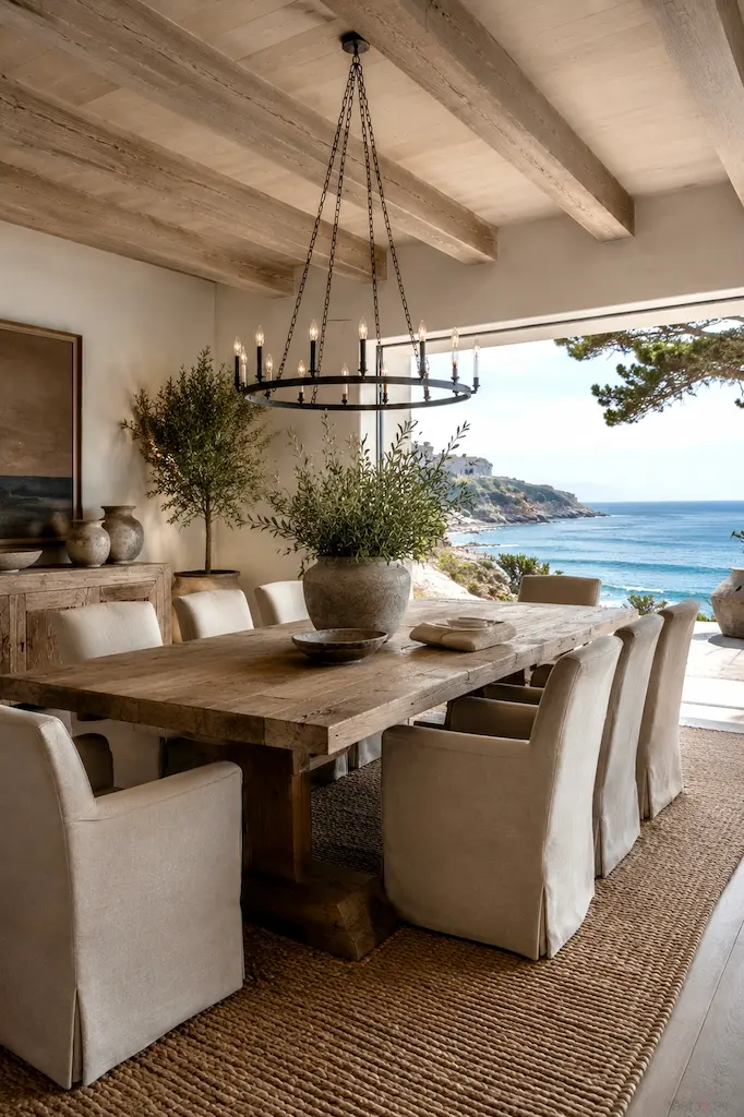
The best ocean-inspired interiors do not attempt to reproduce the beach indoors. No room has ever improved because it contained more miniature anchors or an enthusiastic collection of seashells. Instead, they recreate the conditions that make coastal places feel appealing: natural light, breathable materials, imperfect surfaces, and enough visual calm to notice the weather changing outside. They also understand restraint. A room does not need to announce its proximity to the sea. It can suggest it through a woven chair, a limestone table, a faded blue textile, or the slightly rumpled character of linen that has sensibly declined to behave like polyester.
This may be why coastal interiors feel calming even when they are not especially minimal. Nature does not coordinate itself perfectly. Sand does not match stone. Driftwood does not consult the sky. Olive leaves turn silver when the wind moves through them, and the sea changes color without asking whether it still works with the cushions. Yet everything belongs.
A Caliterranean home follows this same instinct. It does not ask which shade best represents the ocean. It asks what happens to a room when it welcomes light, texture, air, and the quiet irregularity of natural materials.
The ocean was never only blue. Our homes need not be either.
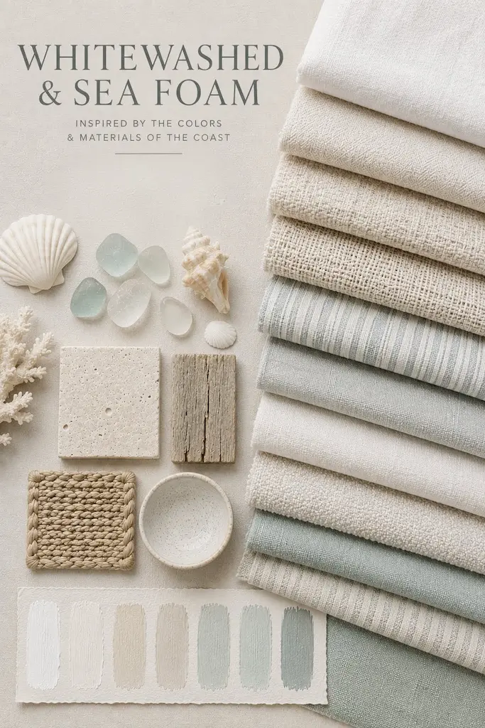
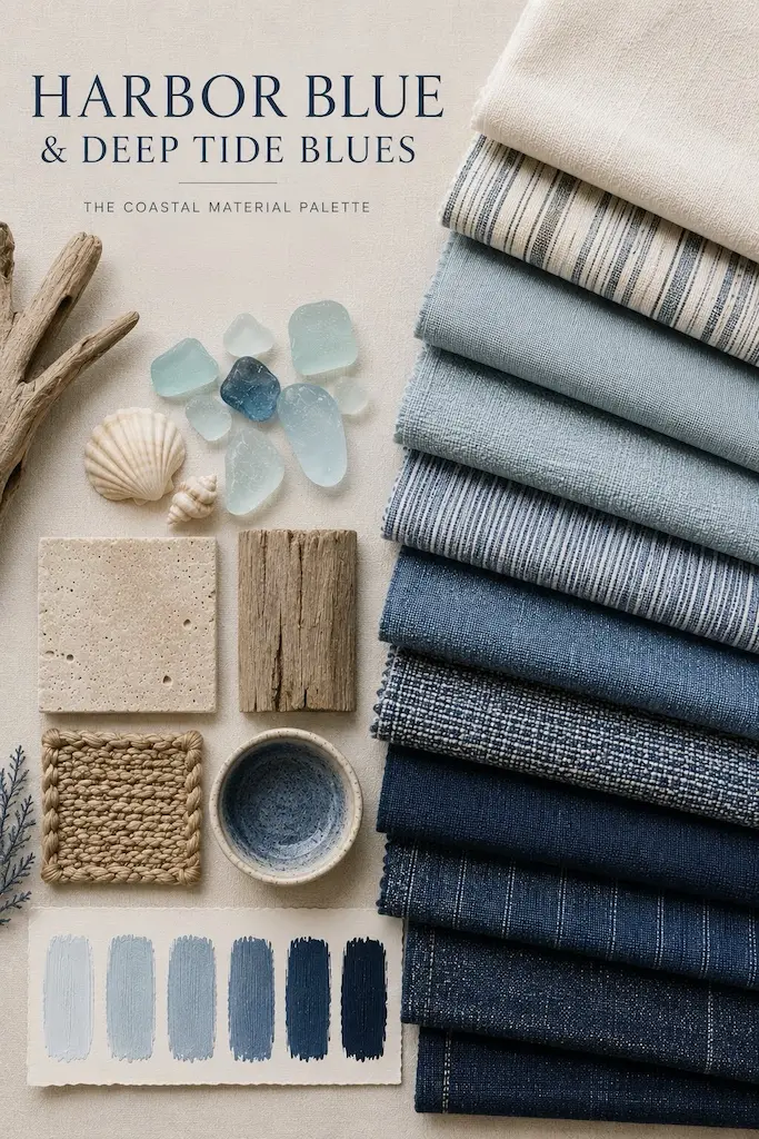
Designer’s Note
Bringing ocean color into a home begins with resisting the temptation to decorate around a theme. The goal is not to recreate a beach. The more thoughtful approach is to borrow its balance.
COLORS
Begin with warm, light-reflective tones rather than stark white. Ivory, chalk, sand, pale plaster, and soft limestone create a foundation that feels bright without becoming clinical. Coastal light is rarely cold, and the surrounding materials should not be either. A restrained room with layered surfaces will often feel richer than one filled with competing colors. Blue works best when it appears with purpose. It might belong on painted cabinetry, a single textile, a ceramic lamp, or a piece of art. Choose a blue that relates to the landscape you are referencing: misty Pacific gray-blue, faded Aegean cobalt, sea-glass green, or the deep indigo of water seen from a shaded terrace. Muted greens help connect the palette to the land surrounding the sea. Olive branches, herbs, eucalyptus, weathered sage, or potted citrus introduce life without creating a sharp contrast. They remind us that coastlines are not made from water alone.
TEXTURES
Allow texture to create much of the depth. Linen, brushed timber, woven fibers, limewash, clay, stone, and handmade ceramics introduce small variations that become more visible as daylight changes. Most importantly, pay attention and consider how light enters the room. Use curtains that soften rather than block it. Avoid placing unnecessary furniture in front of windows. Let walls, floors, and natural objects respond to the changing day.
A coastal palette should look slightly different at breakfast than it does before dinner. That is not inconsistency. That is the point.
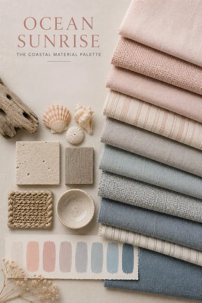

Explore our Coastal Materials Pinterest board for curated interiors, timeless materials, and ocean-inspired design ideas.
The story continues. Here is your next read → Greek Homes Beyond the White Walls & Blue Doors