The Formula for a Coastal Home—Without Decorating It Like One
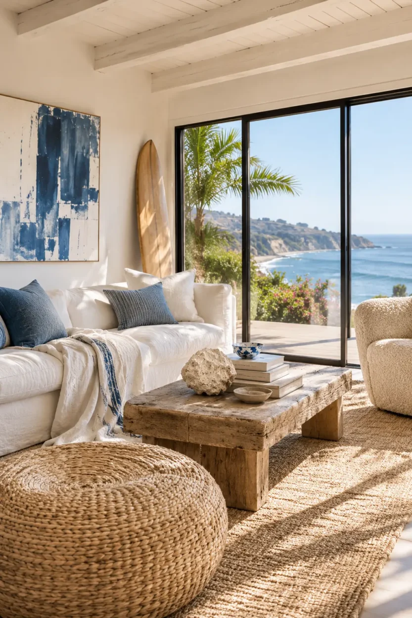
You know you like a coastal-feeling room but have no idea how to explain it. The windows are open, the light is bright, something blue, something wooden, and suddenly your shoulders seem to have dropped an inch and you feel relaxed. Nothing in the room actually says coast, yet somehow you can practically hear the water. The sensation belongs equally to California beach cottages and Mediterranean summer houses. The word “coastal” has become one of decorating’s more unfortunate shortcuts. Blue-and-white stripes, coral on a shelf, rope around something that previously had no need for rope, perhaps an ornamental oar for the person who has never rowed anywhere. We keep decorating with the coast when the more interesting trick is designing around how the coast makes us feel. The interesting question isn’t “What style is this?” but “What exactly made us feel that?” And feelings, inconveniently, do not come with paint numbers.
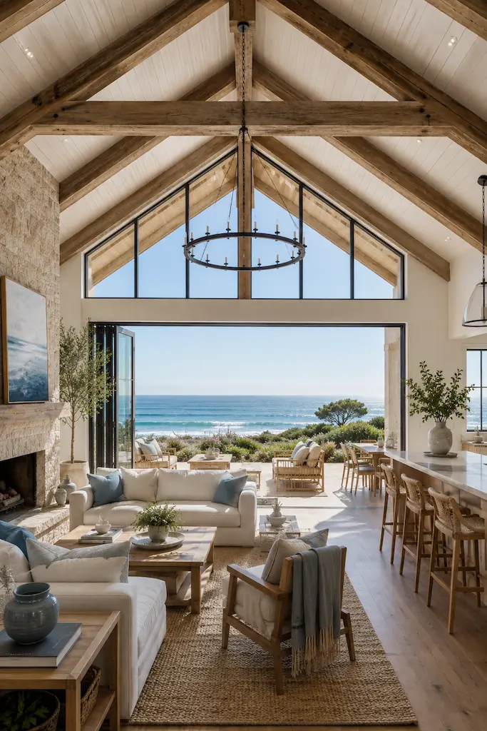
Look closely at a contemporary room in Mallorca, Thessaloniki or on the Amalfi Coast, and the palette is rarely shouting for attention. Chalky whites are softened by sand, clay or faded blue; timber looks better for having aged; plaster is allowed to reveal the hand that made it. In California, the vocabulary changes—more glass perhaps, cleaner modernist lines, a surf-culture looseness—but the room often arrives at remarkably similar conclusions.
Coastal decor understands something that decorating sometimes forgets: ease is partly the absence of things demanding your attention. Sunlight does much of the decorating. Materials are allowed to behave like themselves, and furniture doesn’t appear terrified of being sat on. That gives us a useful place to begin. Instead of starting with a style—Mediterranean, Californian, coastal, modern—start with the sentence “I want this room to feel…” Cool after a hot afternoon? Washed by the sun? Quiet enough for a Sunday morning? Once the feeling is specific, the decorating decisions become considerably less mysterious.
This is the idea behind the VeniS Atelier 3 × 3 Formula: three colors, three materials, three textures, one feeling. It is not a list of nine things you are required to buy; your credit card may stand down. It is a way of restricting the visual vocabulary of a room so that the atmosphere becomes stronger than the individual objects inside it.
For our transformation, we chose sun-washed coastal ease: colors and materials that appear to have spent several summers in the light.
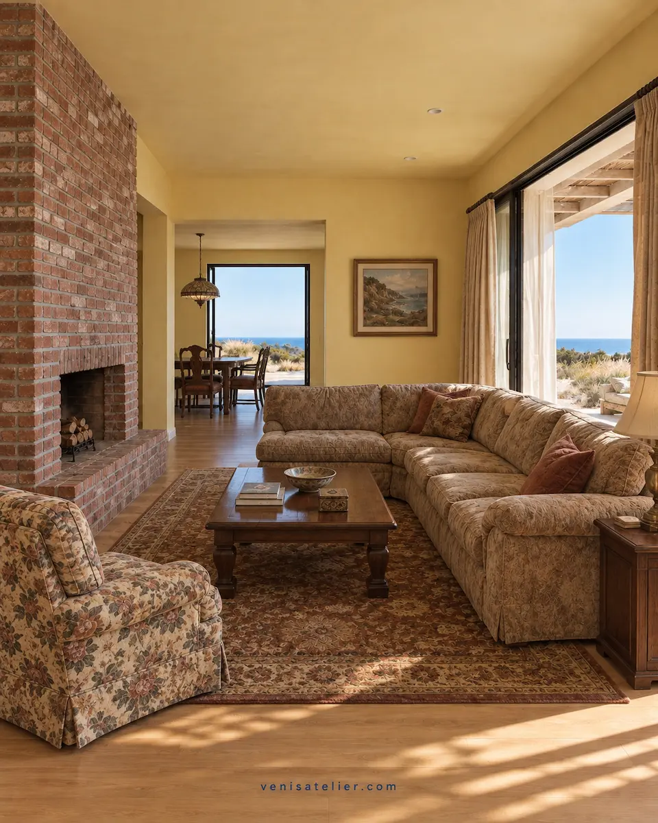
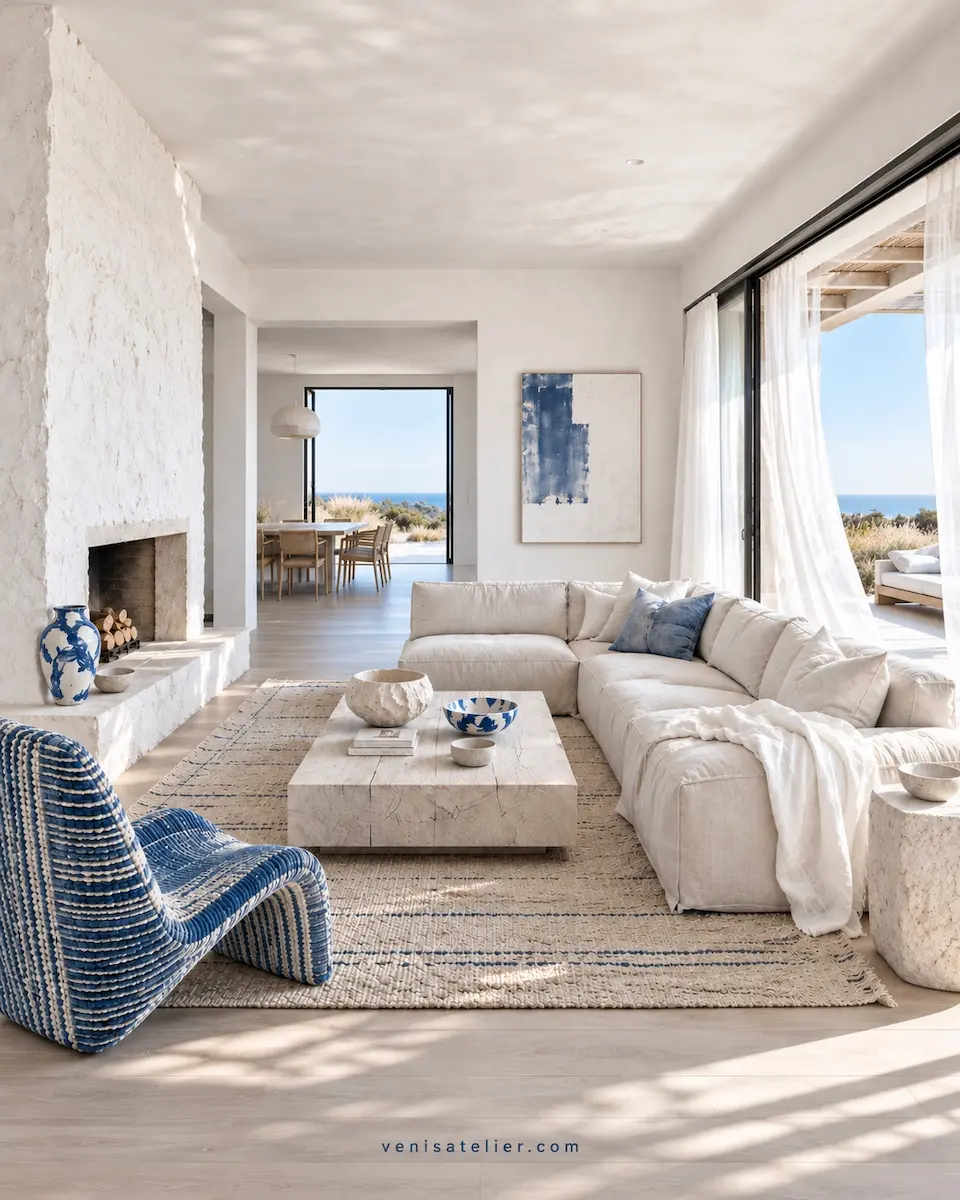
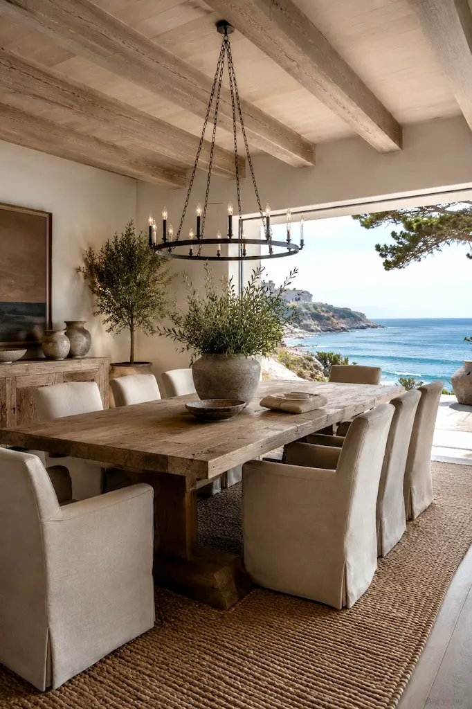
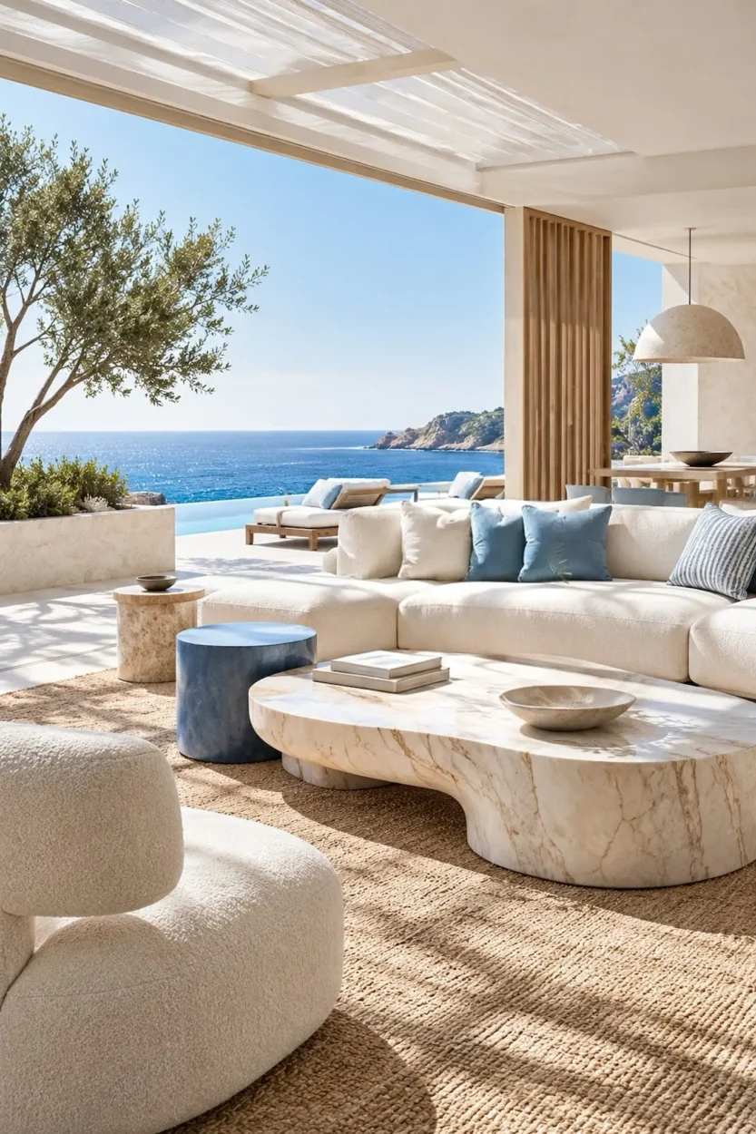
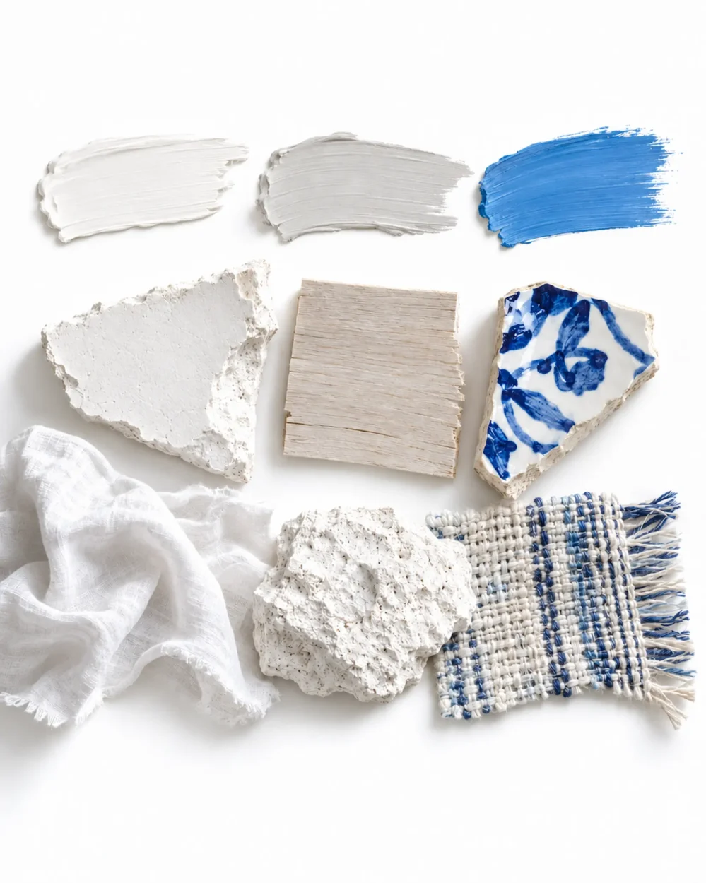
Could our 3 × 3 formula bring that atmosphere into an ordinary home without rebuilding it—or emptying the bank account in the process? The answer would have to come from three colors, three materials and three textures, each repeated across the rooms without being mechanically matched. The three colors are chalk white, sun-faded sand and washed blue—not navy, not turquoise, and certainly not the shade of blue that announces BEACH HOUSE before you’ve taken your shoes off. Think instead of colors that appear to have spent several summers outside. Then choose three materials: plaster, pale wood and ceramic. Plaster gives us the mineral quality of Mediterranean walls; wood brings California’s beach cottages and modern coastal houses into the conversation; ceramic belongs naturally to both worlds, from centuries of Mediterranean pottery traditions to California’s extraordinary studio-craft culture. None is particularly precious, which is part of the point.
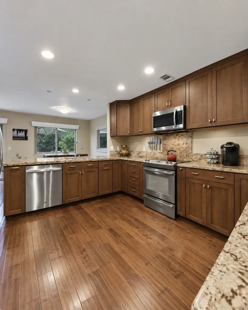
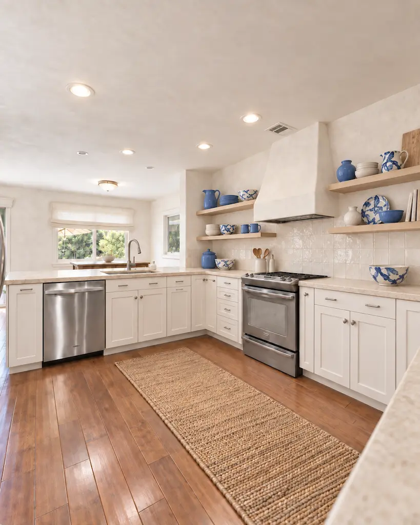
Finally come three textures: rumpled cloth, rough mineral surfaces and woven fiber. Texture is where a restrained palette avoids becoming a beige waiting room. A slightly irregular wall catches changing light, woven material introduces shadow and pattern, and relaxed cloth makes the radical suggestion that perhaps nobody needs to iron the house.
Notice what isn’t included in the formula. There is no instruction to buy a Greek urn, import an olive tree or place a surfboard in the corner. If you surf, by all means keep the surfboard; if you don’t, the room will survive the disappointment.
The next step is where the formula becomes useful rather than merely pretty: repeat, but don’t match. Chalk might appear on the walls and return in a ceramic lamp; sand might live in the rug and then reappear in timber; washed blue may be nothing more than one chair, a piece of art or a faded textile. The eye registers the relationship without the room looking as though nine items arrived together in a “coastal living collection.”
Scale matters too. Mediterranean and California coastal rooms often feel relaxed because they allow a few substantial things to do the work rather than filling every available surface with decoration. One large ceramic vessel has more presence than seven tiny accessories politely explaining the theme.
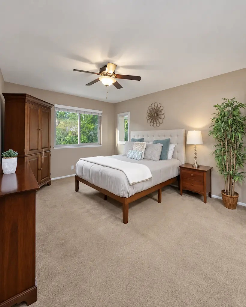
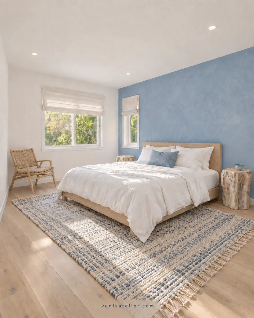
And then there is empty space. Coastal living is fundamentally connected to air, movement and the journey between inside and outside, so a room that feels coastal needs somewhere for the eye—and the person—to move. You cannot accessorize your way out of a room that has been stuffed like a suitcase.
This is also why imperfection belongs in the formula even though it isn’t one of the nine ingredients. A handmade ceramic edge, uneven plaster, faded timber or crumpled fabric changes throughout the day because light catches every irregularity differently. Perfect surfaces reflect light; imperfect ones give it something to do.
The final test is remarkably simple: remove the clues. If the blue cushion disappeared, would the room still feel coastal? If there were no shell, photograph of the sea or strategically abandoned straw hat, would the sensation remain? If the answer is yes, the room is working. That is the difference between decorating a house like the coast and designing a house around the feeling of the coast. California gives us informality, openness and an extraordinary comfort with mixing serious design with ordinary life; the Mediterranean brings shade, craft, mineral surfaces and the beauty of materials that improve rather than panic as they age.
And that is really what the VeniS Atelier 3 × 3 Formula is designed to capture. Three colors + three materials + three textures = one feeling—not because nine ingredients can magically manufacture a beautiful home, but because they force us to decide how we want to live before deciding what we want to buy. The best coastal room may be the one with almost nothing “coastal” in it at all.
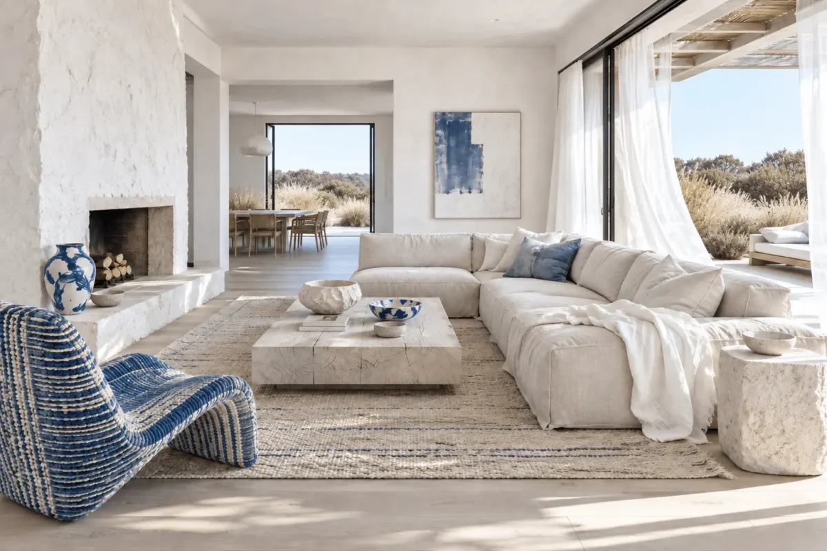
HOW THE FORMULA BECAME THE ROOM
Change | What it accomplishes |
Paint the walls and ceiling chalk white | Establishes the principal color and reflects more daylight |
Replace the dark flooring with pale wood | Lightens the room’s largest horizontal surface and introduces natural warmth |
Refinish the existing table in a pale wood tone | Reuses a substantial piece while connecting it to the new floor |
Apply a mineral-plaster finish over the brick fireplace | Introduces plaster and rough mineral texture in one move |
Recover the sofa in sun-faded sand cloth | Adds the supporting color while making the largest piece feel softer and quieter |
Add relaxed curtains and a woven rug | Introduces movement, rumpled cloth and woven texture |
Use washed blue selectively | A chair, artwork, cushion or ceramic creates punctuation without announcing “beach house” |
Add a few handmade ceramics | Introduces craft without filling every surface with decoration |
Kept: the architecture, windows and any furniture worth refinishing.
Refinished: the table and fireplace.
Replaced: the flooring, sofa covering, rug and curtains.
Added: washed-blue accents and handmade ceramics.